 |
| Photo: nhluniforms.com |
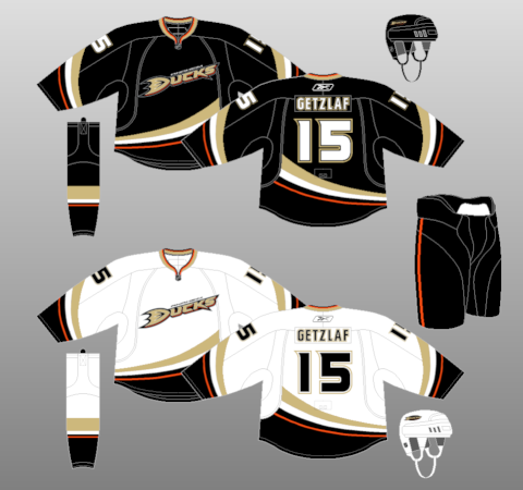
Right here is the current home and away set for the Ducks. For the most part, you could say it's a modernized version of the design for the Mighty Ducks jersey. Obviously, different colors and different logo.
The Logo: I am a fan of word marks from time to time. But the biggest thing when using a word mark on jerseys, is to make it stand out. I think this is annoying. 'Anaheim' on the logo is so small that it is just a nuisance, and maybe it's just me, but the bronze color on the black jersey, and even the white jersey seems to just blend in with it all. I like the orange added into the teams color scheme, maybe they should have swapped spots for bronze with orange. Honestly, stick the Mighty Ducks logo on it, or even just the 'D' foot, and this looks much better.
The Color Scheme: I think it's clear I don't like the bronze in this. I just think it's dark and dull with everything else. Black, White, and Orange I think could be very sharp on it's own. I wonder what the jerseys would look like if there was no bronze, just orange in place. Would that be too much?
 |
| Photo: OcRegister.com |
Font: this is one part I truly like with this set, and I think this is a font that should continue on to future Duck sets. For some reason I just think it's original, but also goes with the Duck name.
Jersey Design: This is the big part of the jersey. The part that brings everything together. Without it, you have a logo on a solid color jersey. As I stated before, in a nutshell, it's a modernized striping pattern of the Mighty Ducks look, and as it should be. The curved swoops, especially on the arms, are sharp, and have a nice flow to them. One thing that could make this much better, is if they just continue the design, instead of just stopping part way through. Why did they do that? I mean, clearly I know the template didn't allow it, but why make the template like that though? That's something that always bugged me about the jersey. For the most part, It's a look that's decent. I'm not going to say it's bad, but at the same time, I wouldn't brag about this jersey, even if they won their only cup in it.
Later on their first alternate with their new set was unveiled.
 |
| Photo: Jeff Gross/Getty Images To be honest, this is a design that I think should be inherited to an away version as soon as possible. I know the side paneling is similar to that on the Islanders old black alternate, but I think it fit more 'Ducks' than 'Islanders'. And like I said, the 'D' for the crest looks great in my opinion. My only complaint would be the numbers lack orange. They made orange the complete secondary in this, yet the numbers lack it. I think this could be made better with just an outline of orange on those numbers. |
Let's wrap this up. For the most part, the current home and away are jerseys I can deal with. If they don't change them for a while, or just have small tweaks, I'd be fine with that. If there ever is a severe change, it either has to be in the direction of the Mighty Ducks, or going with something close to the alternate. I think seeing anything too traditional from the Ducks might be losing a unique jersey set that the NHL needs.
My end scoring for the whole set is : 3.9/5 -- 7.8/10
The alternate adds a couple decimal points to it.
Did you agree with me? Do you want to add something I missed? Do you have a concept that could make the Ducks look better? Let me know below by rating their whole current set out of 5!