I'm not really venting though. In fact I'm very happy about this hockey season so far. Mostly because my favorite team is in last place and is showing no signs of leaving the basement. Years and years of Buffalo sports we've been missing the opportunities. We've always been mediocre enough to get 'meh' draft picks in both major sports. We've always missed out on great QB drafts when we need one. We always fall short of a top five pick in the NHL which for the record is always a safe bet pick. This is the year. The year where we can finally make a ringer in the draft. Yes I know they lottery doesn't guarantee us the first pick, but finishing 30th guarantees a top 2 pick which potentially can be a generational player. Sure it's not that fun not watching too many hockey games anymore but I know it's for the better.
I see a lot of teams joining in the 'tank' now and wanting to place last, or close to it. I don't blame them, but they are late to the party. Also just a side note we (Sabres) are not losing on purpose, we are just a very bad team. Our genius GM Tim Murray made great moves in the off-season to have the look that we are going to progress..but he knew..he knew the moves he made would provide no actual help. We are just one terrible team that couldn't win a game even if we tried.
Enough with me bragging about losing. Whether you agree with cheering for your team to lose or not, it's time to view these concepts.
COTW Jan. 25 - 31 vote (ends Friday at 11:59 pm Eastern)
COTW Feb 1 - 7 vote (ends Friday at 11:59 pm Eastern)
World Cup Top 3 Teams vote (ends Friday at 11:59 Eastern)
Don't forget to vote. Sign up for the reminder so you don't forget!
______________________________________________
--------------------------------------------------------------------------------
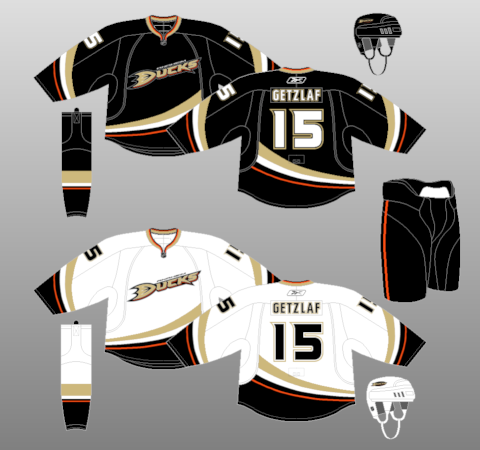
St. Louis Blues - Dylan Nowak

I guess I will start the reviews with my old concept. Over time the logo on this concept has really bugged me. I personally believe just the note logo would make this look a lot better. I always refer to this concept when I want to see execution well done on a photorealistic template. I know, I know, I sound conceited but I was really pleased how this concept turned out. Some bugs here and there but this stands as one of my favorite concepts just because of how I worked on the details of an actual jersey. Granted there are some mistakes I see now but I'm not too worried about it. Jersey itself I think looks nice. Maybe a bit too bright but as a third jersey I think it could work.
Rating: 11/10


Rating: 11/10
Pittsburgh Penguins - Jack K.
Jack, you are lucky that your name was on the file. How was I ..or anyone supposed to know who made this concept? Remember folks, putting ID on your photo not only betters us to recognize it but it also betters you.
Anyways, the design really goes out of it's way to become it's own thing. And I really like that. The front and back jersey design is pretty interesting. It kind of fits the old Pirates theme and I like seeing the RoboPen back! I would scrap the text in the logo, not needed. Also I would make the logo larger..maybe even going over the triangular striping. Same goes for the number on the back.
The rest of the jersey I feel does not fit with the main design you have. Rounded yoke seems to break the unity and the traditional Bruins-esqu striping doesn't go along with what you have for anything else. I always like to have a rule of thumb when having a concept. When you have colors touching..and other colors not touching I like to keep that unified for the whole jersey. You have gold and black touching on the yoke and front and back design but have them separated on the stripes. To be honest, this jersey is all over the place and needs work. It's a bit two faced right now. Pick what you want. A traditional grounded jersey or a crazy awesome out of the box design. Maybe you were trying to tame the wild design on the front but instead of trying to equalize the traditional look and out of the box look just embrace one and stick with it. Trust me, you will enjoy the outcome a lot more. Keep on working and you will keep on progressing!
Rating: 4/10
Nashville Predators - Scott T.
Don't think I've ever seen a Scott T. on HJC, welcome! You have a style that really represents Stephen T. I guess that's just a weird coincidence. Any who, we have a very nice Nashville Predators design. Almost nice enough to see it on the ice for real! Although...don't we? Aside form the color changes for the blue jersey the gold jersey is basically the exact same thing Nashville wears. And the blue jersey is a remake of that with some color changes. I'll just be commenting on the blue jersey for this. I think on the yoke design you don't bring back the 'fang' type of color under the piping near the collar. I think that's an element that should definitely be there. If anything I think you should eliminate the piping and just leave that yoke design. Color placement is fine. Really, that's all this 'concept' is..it's fine. Nothing special, nothing out of the norm.
Rating: 7/10
Dallas Stars - Ryan H.
The supreme leader of HJC grants us a black alternate jersey for Dallas which I believe will be coming in the next season or two. Ryan keeps the nice traditional design to go along with a nice and simple main jersey set. I always love the white and gray striping next to each other on a black jersey, I think it's a very sharp look and with the nice victory green by the side it makes it look even classier. For the most part, I'm a fan of this jersey. The design is simple enough to fit with the rest of their set and it doesn't look bad. At the same time though it doesn't look amazing to me or really scream out anything. It's nice and would like to see it made into an actual jersey so I could see what it would look like. If you were to ask me what changes I would make I wouldn't know what to say. The idea is there and is executed very well. Maybe potentially a colored yoke? Then I feel it would be making the jersey too crowded because white would be too plain. For green you would need a type of outline of white or gray..or both. What can I say? It's a nicely done jersey that looks pretty darn good. Nice.
Rating 8.2/10
And another post in the books. Did you like a concept on todays post? Which one was your favorite, and why? Which one was your least favorite, and why? Let us know what you think. Comment about what you think about tanking or losing on purpose, comment about whether you think cats are better than dogs (they are not). It's always nice to see a discussion in the comments. Although, let's keep it on topic and not get too hostile with each other. I mean after all we all share one same trait, we love them hockey jerseys!
Have a nice day guys and hope you come back to read more tomorrow!